You don’t have to be a graphic designer to create a Pinterest pin design—in fact, once you create a few templates you can use time and time again, you can create new pins in minutes and totally take the pain out of the process! I get asked all the time how to make pins stand out, or how to even create the pin designs in the first place, which is why I’ve put together this simple guide to creating your own Pinterest pins. It might seem daunting, but I promise you it’s not once you get started!
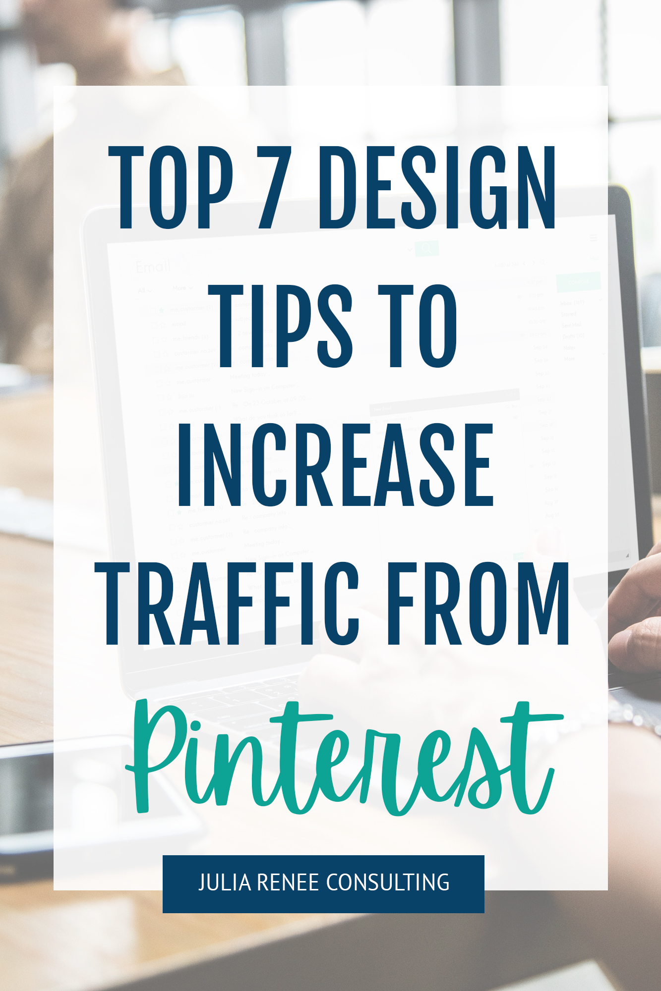
How to create a Pinterest pin design to drive traffic
My number one rule for creating pin designs is to make them easy to read. The easier it is to read, the more traffic you’re going to drive to your site! And the more likely you’ll be able to get clients from Pinterest. If someone has to really try hard to read small text or the pin design is too busy, they’re just going to skim by that pin for something that stands out better. And don’t worry, I’ll be going into more detail on how to make sure your pins are easy to read in this post.
If you need more help with the Pinterest basics, check out my posts 7 Questions to Ask to See if Pinterest Is Right for Your Business, How to Use Pinterest for Small Businesses, and Pinterest Strategy Tips for Small Businesses.
Make sure your pin is the right shape and size
First of all, you want your pins to be portrait orientation rather than landscape. Your Pinterest pin design should be created with a 2:3 aspect ratio— Pinterest recommends about 1000 x 1500 pixels. However you can also go for 600 × 900 pixels, 1200 x 1800 pixels, or 2000 x 3000 pixels; these all fit in the 2:3 ratio.
No matter what software, app or website you’re using to create your pins (I use Photoshop often but Canva is another option that’s free and really simple to use), you’ll be able to either use a pin template or create a blank design which fits to this size.
Keep your colors on brand
When creating a Pinterest pin design, I typically recommend using your brand colors. This keeps your pins cohesive and helps match what people are going to see when they get to your website. If your pins use neon pink with script text but your website uses neutrals like tan and black with serif text, people might think that they have landed on the wrong site if things don’t match up.
If your brand colors are more subtle and you want your pin designs to stand out more, you can adjust them! Try brightening up the shades or pairing your current brand colors with some other colors that may pop more. Or you can use images that have some more color.
What I don’t recommend is going crazy with adding more colors and using 10 different colors on one pin. It can look really busy and make it hard to read or focus on. You can keep things simple to start with and add more colors as you kept comfortable with design, but simple designs are always better than busy ones!
Don’t overdo it on the text
Just like with your pin colors, you want to keep the text simple and easy-to-read. Most people are using Pinterest on their phones, so you need to make sure that the pins can be read on both desktop and mobile. People are skimming over different pins as they’re searching for one that interests them, and if they can’t read your pin easily, they’re much less likely to click on it!
So this means stick to using 1-2 fonts on a pin and don’t use a lot of script fonts, use fonts that are really thin, use text in too many different sizes, or have too much text on a pin. The text on a pin should be like a newspaper headline that will catch someone’s attention quickly; you don’t need to summarize your entire blog post on a pin.

And you also want to make sure you’re taking accessibility and Pinterest AI into account. Make sure your pins can be read by someone who is visually impaired, color blind, or is relying on software to read the text for them. Using yellow text on a white background is hard for the average person to read, and it’s even harder for someone who is visually impaired or color blind.
If your text is sideways or really thin or small, it can be hard for software to read for visually impaired people, and it can be hard for Pinterest AI to read. Pinterest AI is getting smarter at reading text on pins, but it isn’t perfect yet. If your pins are easy for the AI to read, they’re going to get more information about your pin, which can help it rank higher in the search results!
Use high-quality images
Since Pinterest is a very visual place, you need to ensure the images you use on your pins are high quality with good resolution. People are naturally more drawn to things which look nice, and of course having excellent photos is another way of making your business seem trustworthy and experienced. It positions you as an expert, somebody who knows what they’re doing, and this is the vibe you want all of your social media and marketing to give off!
If you don’t currently have a lot of images you can use, there are tons of free sites where you can get free stock photos. Pexels and Pixabay are two of my go-to stock photo sites. And if you’re worried about the photos looking like standard stock photos, they don’t have to be the focal point of the pin! You can overlay text, shapes, or other branding elements so the photo will just be in the background.
And on the subject of images, it is usually best to use pictures without a face in them when creating a Pinterest pin design (but this can vary depending on the industry), which is the opposite of platforms like Instagram. Images without face tend to do better than pictures with faces in because people on Pinterest are more interested in the content or product than the person behind the brand.
Save your Pinterest pin design templates to use again
Sites like Canva have plenty of ready-made pin design templates where you can edit to include your chosen text, colors, and imagery. You can also use any pin designs you create as a template to help speed up your pin creation.
If you’re publishing a blog post every week or month, then it is going to be time consuming to create multiple pins from scratch for each blog post you write. But having a few templates where you can just change the title of the blog post each time you publish a new one will save you so much time.
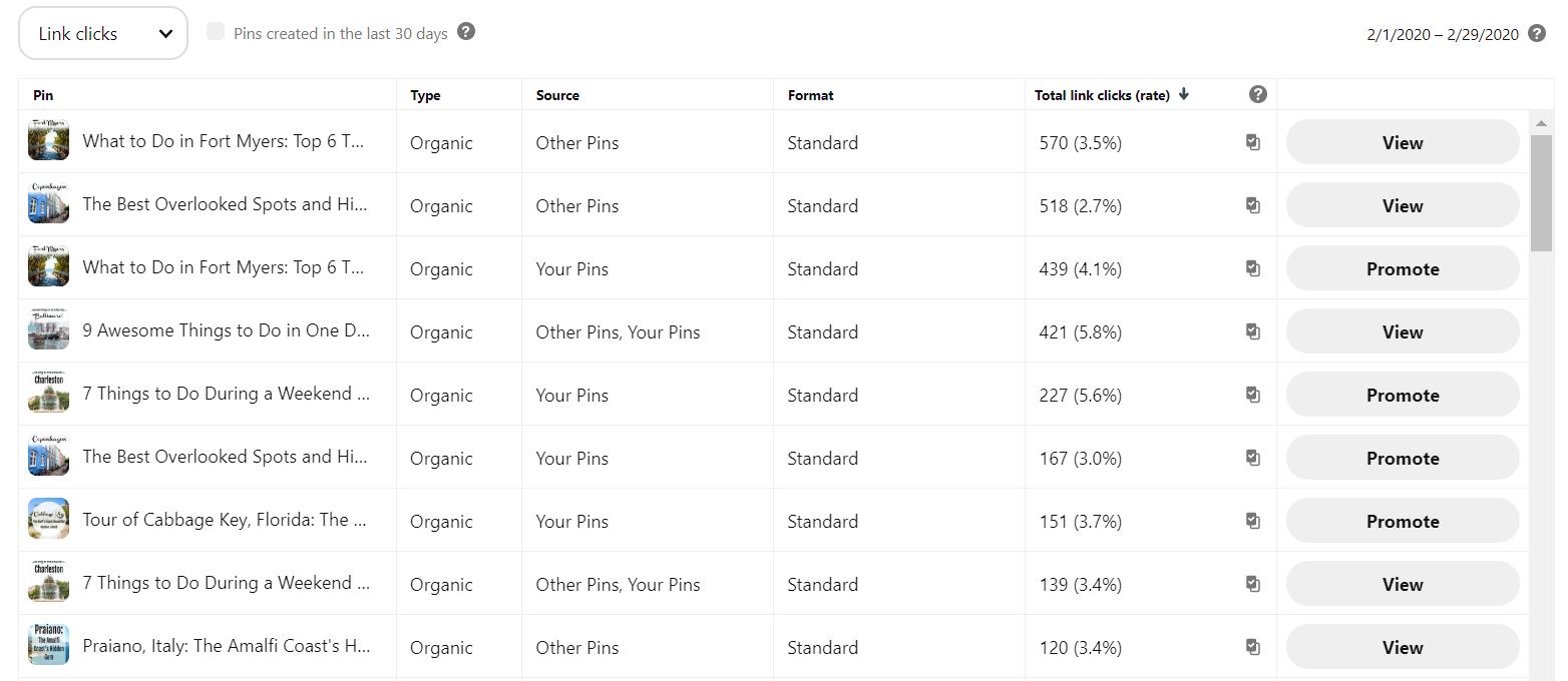
Track your Pinterest analytics
Once you create some different Pinterest pin designs, you need to track your insights to see how they’re performing. In Pinterest Analytics, you can see which pins are performing best for you, and use that pin design (but with different text or imagery where necessary) or create some more similar ones for your future content.
Pinterest does take time for traffic to build up, so I recommend checking analytics on your pin designs a few months after you publish a pin; you’re not going to get good data if you check just a few days after you publish a pin.
Creating a Pinterest pin design doesn’t have to be difficult—there is so much free and low-cost software available now to help you with graphic design, and just remember that keeping designs simple are going to help you more than going crazy and making them too busy! If you want some more help with Pinterest, check out my guide to getting more clients from Pinterest or check out my Pinterest management services if you’re ready to pass off pin design creation!


